SakéMoto Saké
Packaging
Brand Identity
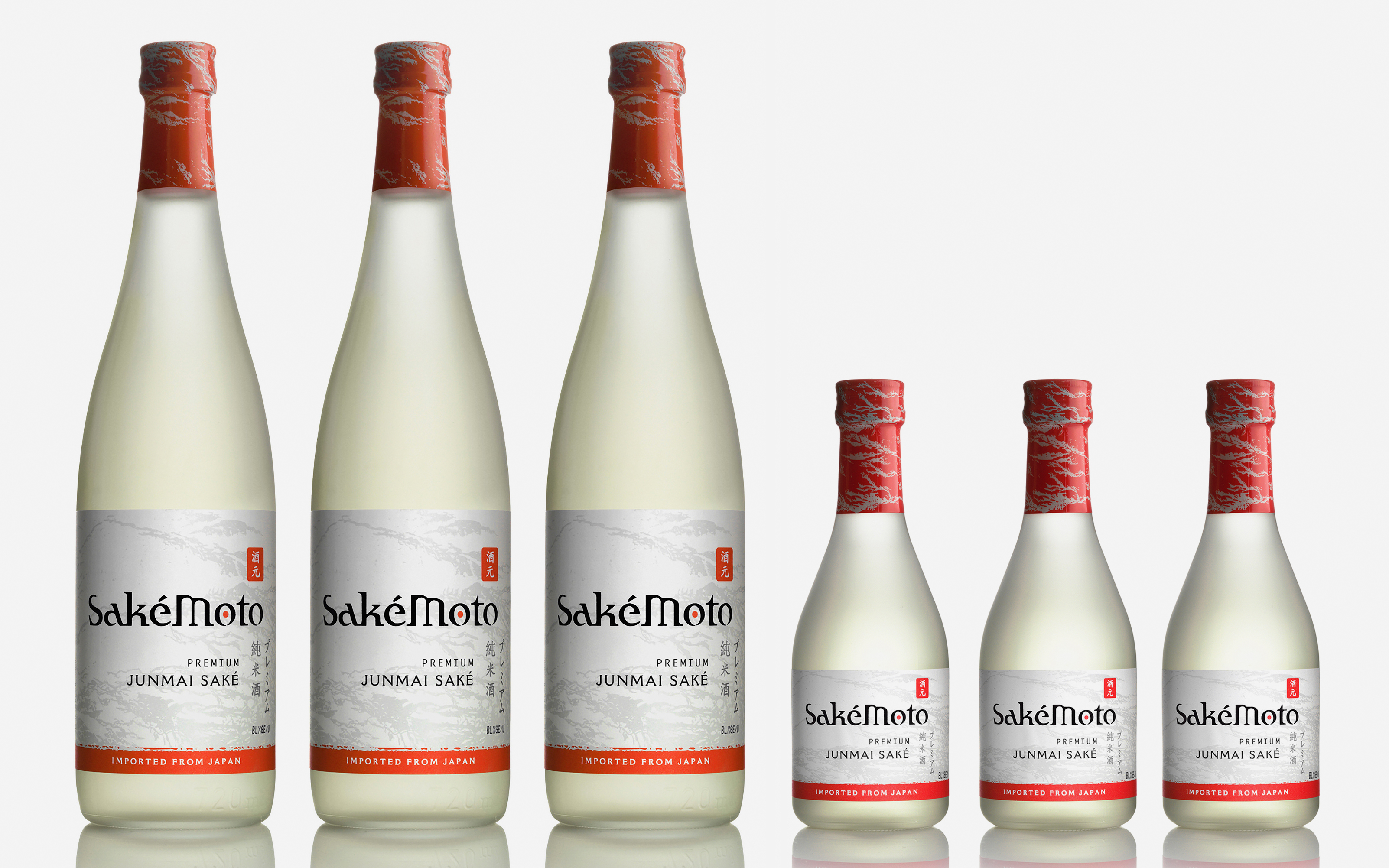
Sakémoto is a junmai saké made entirely from specialty rice and pristine water sourced from Japan’s famous Nada region. We created the packaging and brand identity for this import to the American market — blending a Japanese aesthetic with easily digestible visual cues for those not fluent in kanji.
![]()


Brand
Elements
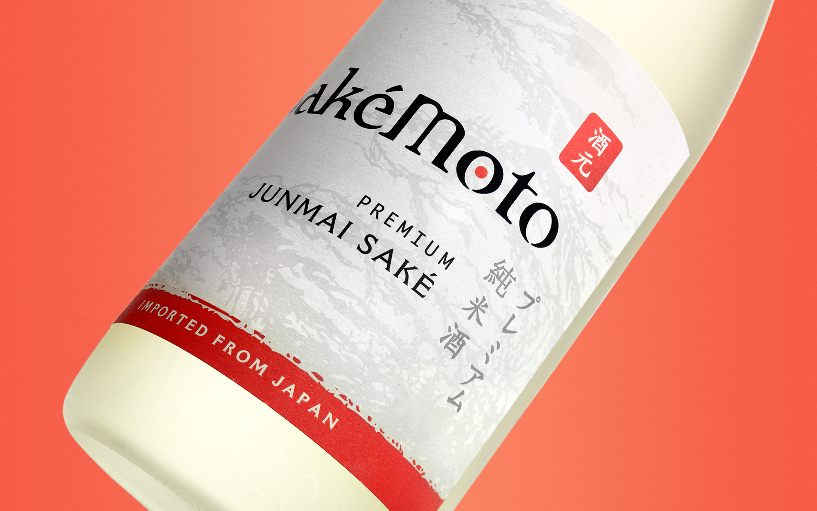
We created a logo that picked up on Japanese brush motifs but is easily read by Americans. The typography and illustration blend Eastern and Western cues which help SakéMoto deliver quality and value to the American palate.
