peet’s reserve
Packaging Design
Packaging for Peet’s Reserve coffees sold in select high-end grocery stores. Peet’s wanted to establish a visual breakthrough on shelf that further differentiates the Reserve packaging from their Core grocery packaging which is primarily dark brown. We carried their country of origin patterns a little further, introducing back some of the hand-drawn quality and more vibrant colors found in the traditional textiles of the growing regions. The new packaging is meant to resonate with a younger target audience while still maintaining shopability.
![]()


Brand
Elements
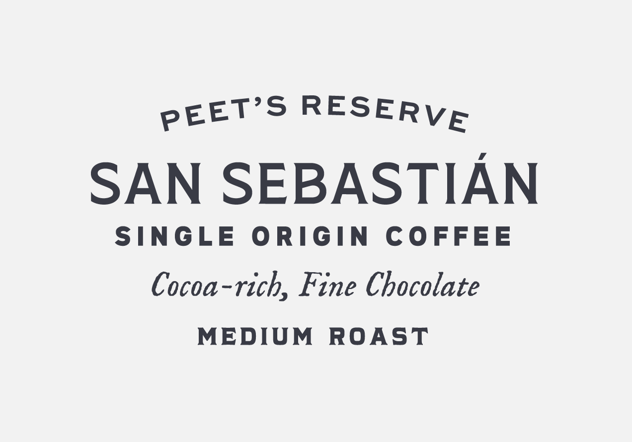
The Reserve line introduces a more diverse range of fonts in order to evoke a more crafted feel than the Core grocery packaging. Updated origin patterns in vibrating colors help it further stand apart.

