Kibo Saké
Packaging
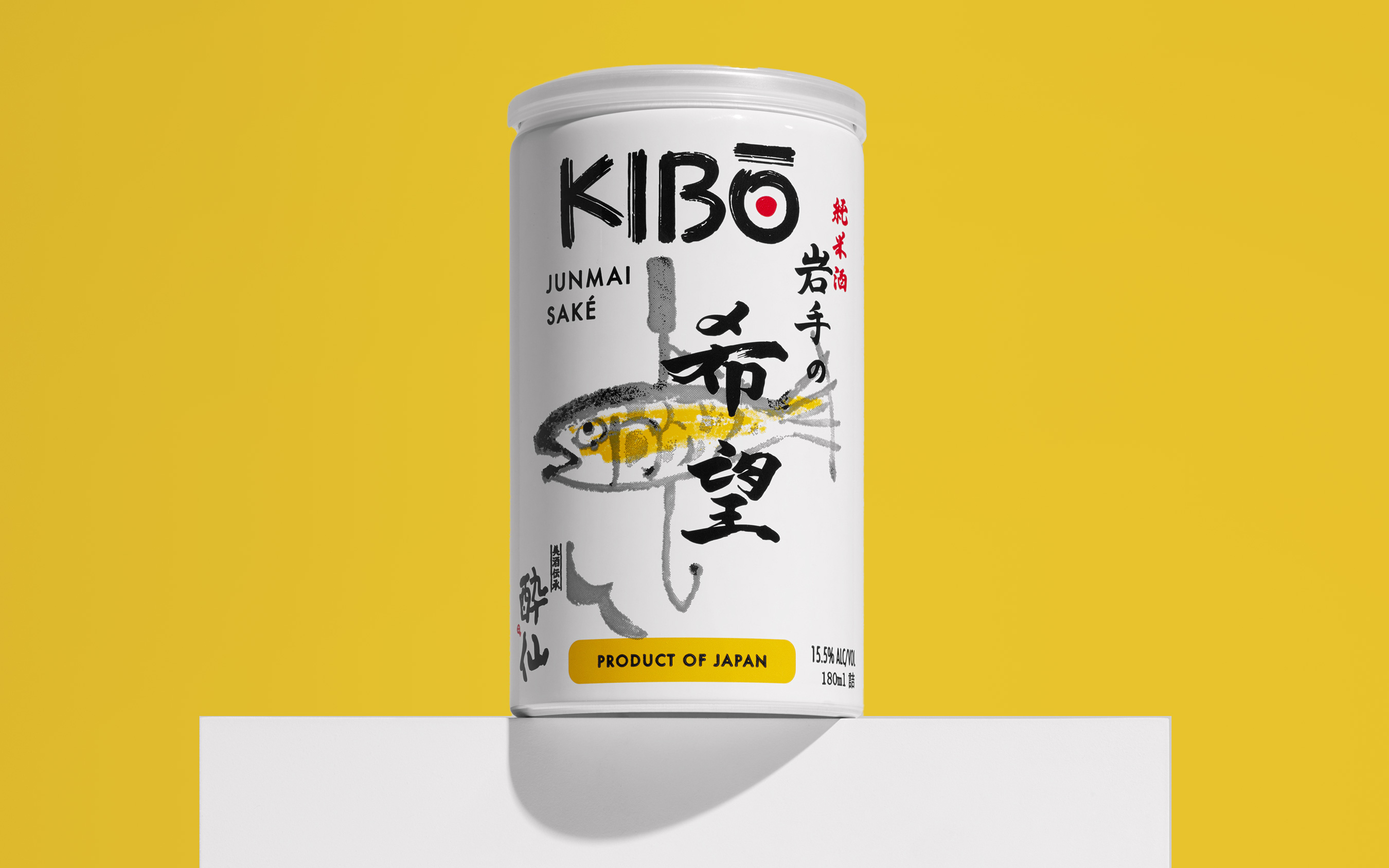
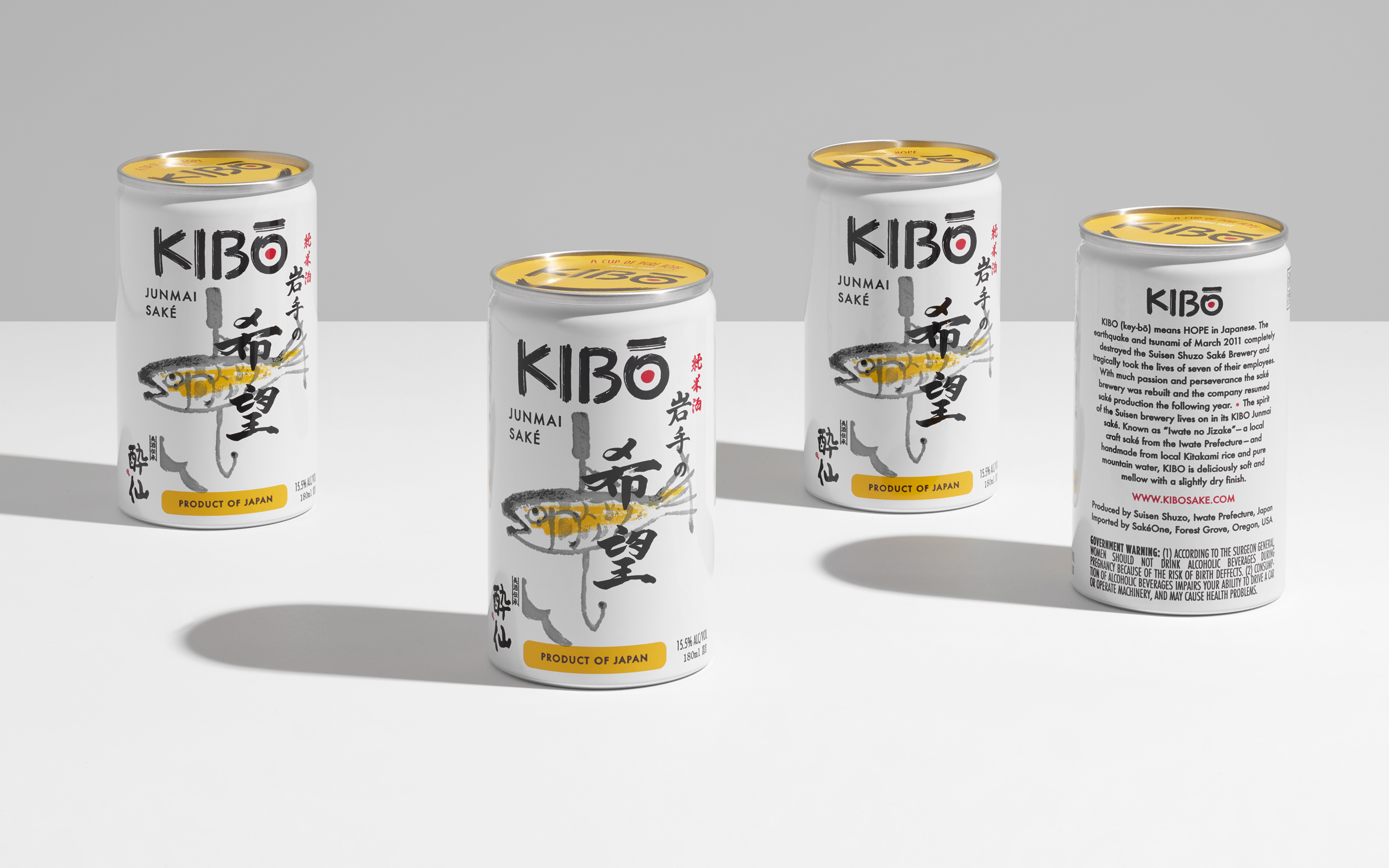
Kibo means hope in Japanese. The Kibo brand was created to help support victims of the Great East Earthquake. We designed single-serve cans that feature a fish and hook painting by the Japanese artist Xoo Xoo. Being one of the first sakés to come in single serve cans, Kibo has become a favorite at outdoor events and music festivals.
![]()


Brand
Elements
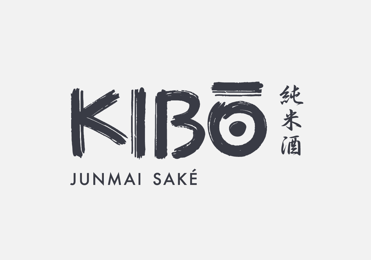
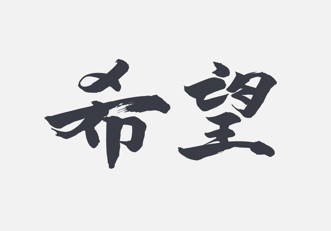
We developed an ink brush logomark that chimes with the kanji incorporated in the painting. We also used the Futura font which has a global appeal and a timeliness quality.
