

ishilin wines
Package Design
Ishilin means wind in the native California Chumash language. We created an evocative label with an abstract painting that captures the quiet and beguiling weather of the Central coast. This is a beautiful, but rugged terrain where gusts coming in from the ocean make their way through rocky canyons. Ishilin makes lucious pinot noir that perfectly expresses the feeling of the region.
![]()

Brand
Elements
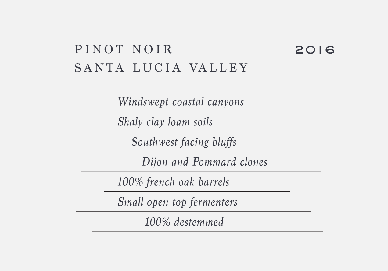
The Ishilin logo includes a simple typographic twist: the dot in the “i” blows off to the right. Support typography further reinforces the idea of wind and movement using italics, offset rules and generally asymmetric layouts.

