gold & oak chardonnay
Naming
Package Design
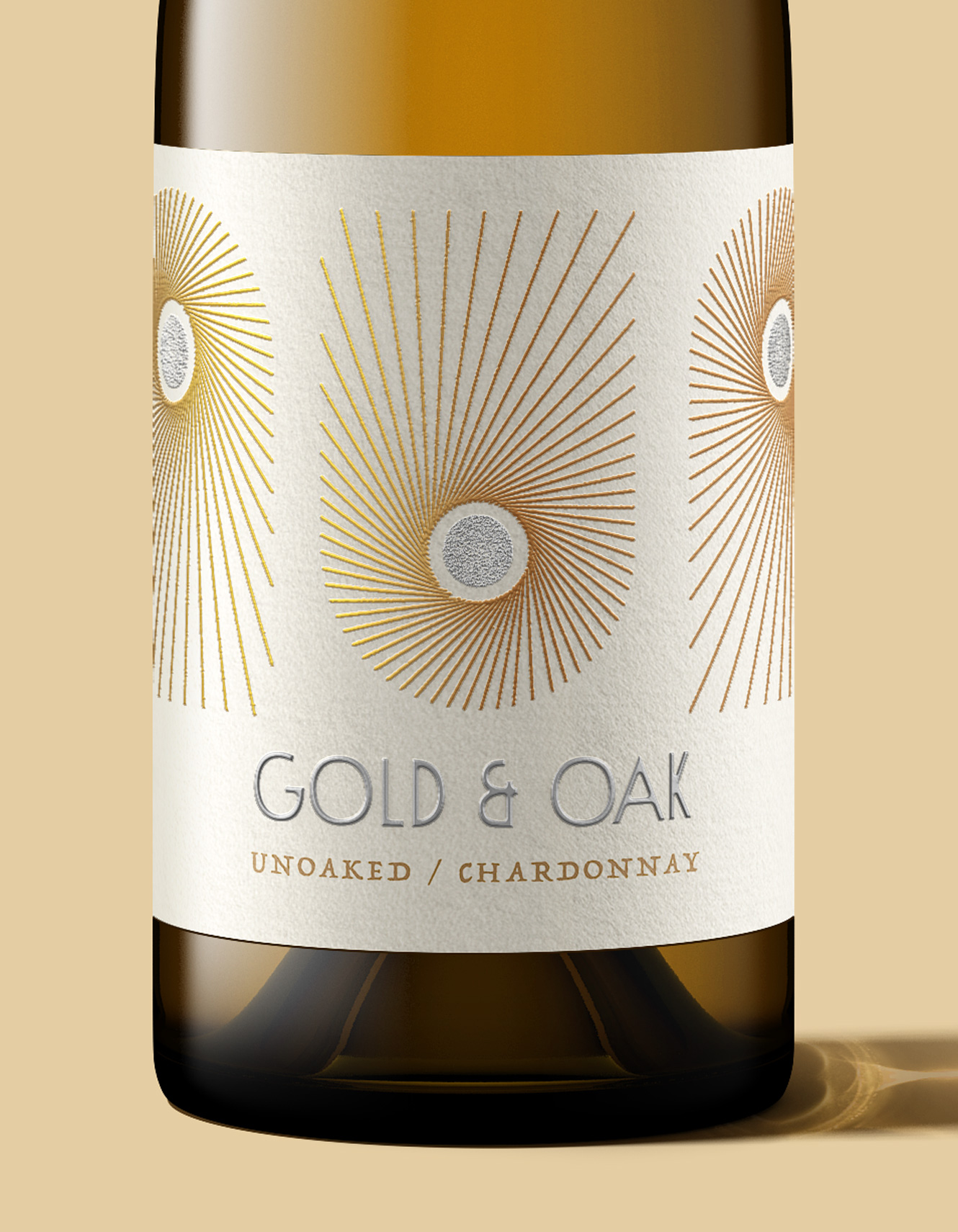
Concept packaging for Gold & Oak, a line of Chardonnay-only wines that offer a range of flavor profiles from buttery to fruity to minerally to clean. Something for every lover of the varietal. We developed the name and visual concept, celebrating the sun and its role in creating great wine. The overall vibe is modern Art Deco.
![]()


Brand
Elements
The 1930s are the stepping off point for the abstract sun icon and the embossed logotype. Antique small caps support the Deco feeling.

